LargeImg
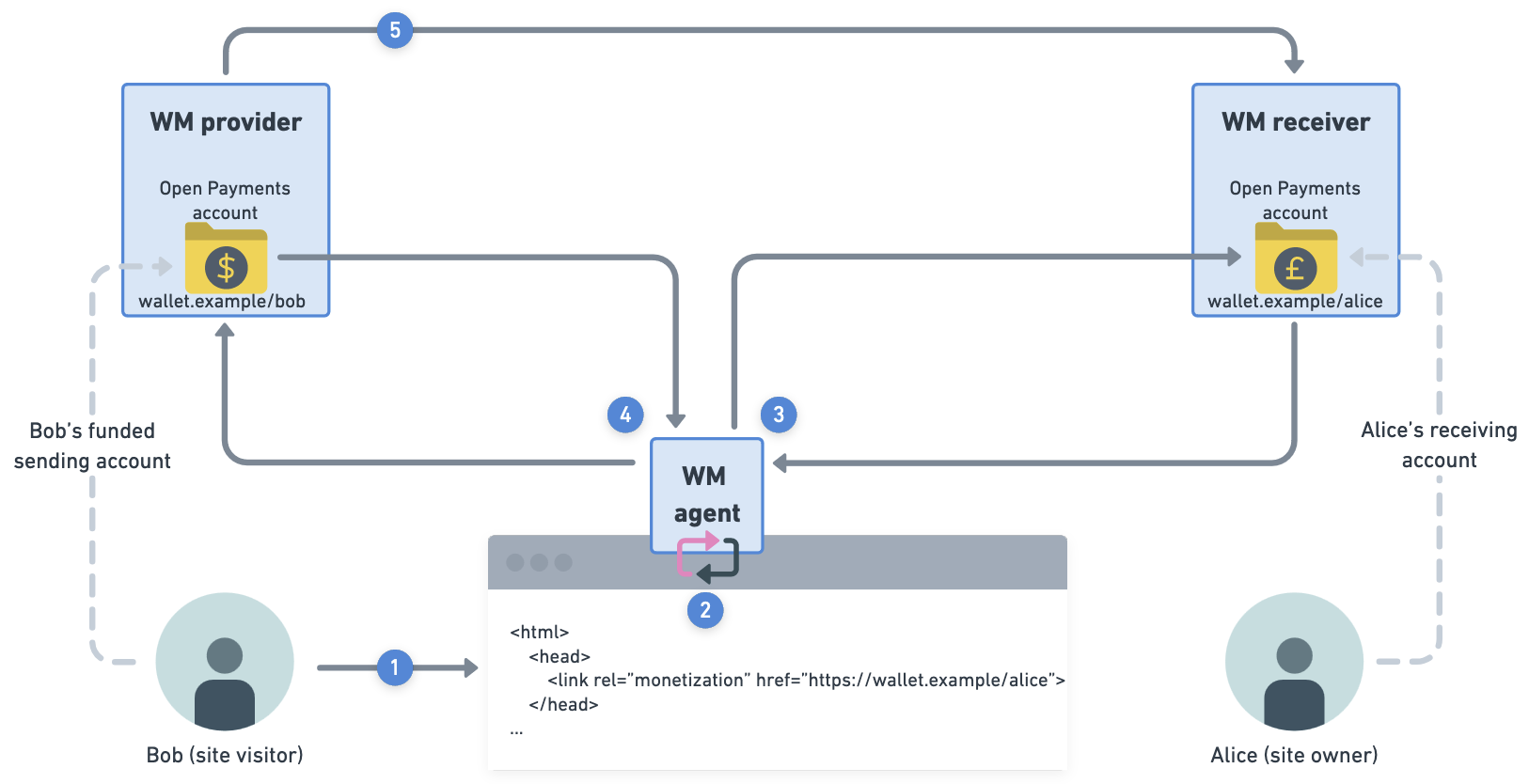
If you’re working with an image or diagram that is larger than our available content area, use this component to allow users to view the full image/diagram in a new tab.
The component adds a link to “View full image” with an external link indicator under the bottom-right corner of the image. It takes in a src and alt, just like a normal img element.
To use the component, the page must be in .mdx format. Change the format from .md to .mdx if necessary. All your existing markdown will still be supported without issue.
Import the LargeImg component like so:
import { LargeImg } from '@interledger/docs-design-system'Use the <LargeImg> component within your content like so:
<LargeImg src="/img/OMG_A_GIGANTIC_IMG.png" alt="A really large diagram" />By default, there will be a border around the image. To remove the border, pass in a hasBorder={false} attribute.
<LargeImg src="/img/OMG_A_GIGANTIC_IMG.png" alt="A really large diagram" hasBorder={false}/>For user doc diagrams, be sure to include the docs folder in the path.
<LargeImg src="/img/docs/OMG_A_GIGANTIC_IMG.png" alt="A really large diagram" />